November 21, 2024

The Journey of a Designer Through an MBA

The earlier days of my design career were not as a UX/UI designer, but rather as an illustrator, which is something I did for around 7 years that shaped my perspective on how to communicate with clients, manage projects, and develop my visual work. With the passage of the years, things started to drift in my head a little bit. I felt the curiosity to try new areas of design that required more complex thinking and were related to solving more substantial problems without relying solely on the subjectivity of my artistic vision, and that's how I started transitioning my career into UX and digital product design.

However, a couple of years after transitioning to my new realm, even though I was doing quite well in terms of visual design execution and, somehow, problem-solving, I noticed that there was something in my skillset that was not aligning completely with my new 'UX Designer' title just yet, but I couldn't sort it out completely.

It was until a few weeks before the COVID lockdown that I came across the 'Business Thinking for Designers' ebook by Ryan Rumsey, and it sparked in my head the missing piece in my skillset that I was not able to detect before: I was lacking business knowledge and understanding.
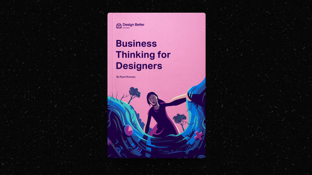
Business Thinking for Designers by Ryan Rumsey

I found out that due to my more artistic background, I was used to managing my design work in a way that was not often the most efficient in a business environment, which often made me have difficult times quantifying design impact, struggle to manage communication with stakeholders, and overall limited my understanding of business constraints, which was very frustrating.

Even though Rumsey's ebook opened my mind immensely about business concepts beyond simple 'conversion rates' like competitive advantage, trade-offs, market forces, business models, feasibility, differentiation and more, I ended up craving more business knowledge in order to fulfill my desire to become a designer that not only 'designs beautiful things' but also a designer who 'designs things that build impact'. My journey into the world of business wouldn't stop there; it was just the beginning.

The Crazy Decision of Enrolling in an MBA

A couple of years later, in 2023, with that curiosity still present, I took the decision to enroll myself in an MBA at University of Chile (a program fully in Spanish), one of the most prestigious business schools in Latin America, and relocate to Chile... and to be honest, I was terrified.

Even though I already had plenty of years in the corporate world and had already read several books about business and marketing by that time, in the end, I was still a designer who had almost no idea about stuff like finance and economics, so the impostor syndrome got to me for the first months in the program.

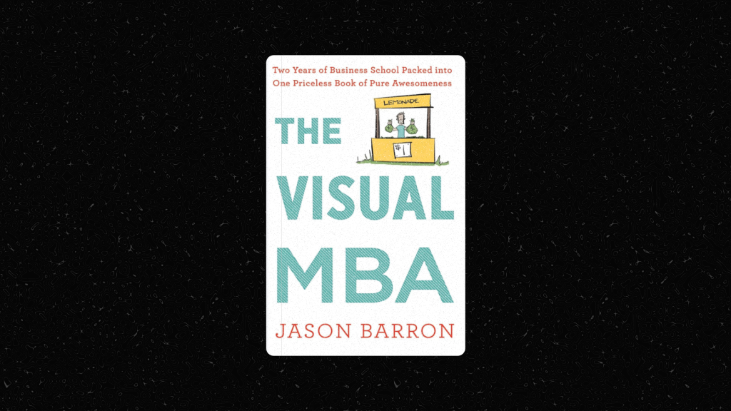
It was exhausting, having to work remotely while enrolling in a demanding degree that covers many subjects completely outside your expertise and background, but as time went by, I started to flow with it, to get more familiar with the numbers, with the concepts, and with my new friends at the MBA who supported me to make this personal challenge less harsh. Also, finding out that it's not completely uncommon that some well-seasoned designers in the industry opt for pursuing an MBA degree to polish their career paths inspired me even more to keep pushing in this direction, like the case of Jason Barron, an American designer who did an MBA and published a wonderful book summarizing all the content of the degree with hand-drawn illustrations (highly recommended book, by the way!).
What to Expect in an MBA as a Designer?

An MBA can be broad and cover many subjects that in some cases will have little or no connection with a designer's duties, and it might take a lot of courage for us to get out of our comfort zones and open our minds to different areas of knowledge that sometimes can even clash with the creative side of our brains.

However, there are certain subjects and courses that I believe have brought me the most value for my design career. Some of them include: Entrepreneurship, Digital Marketing Strategies, Business Strategy, Operations Management, and very importantly, People Management.

Having formal training in these areas has been extremely helpful for me to connect the dots in my design career, but if you're a designer who also enrolls in an MBA program, you will probably find other topics more useful, so it depends on your needs, your expertise, and your career path objectives.
Of course, an MBA is not a design-oriented program, so you must be aware that part of the dynamic will be to maintain your design perspective and figure out ways to apply all the different business frameworks to design, and adapt yourself to business thinking rather than a merely creative one, but that's something that will only come with practice.

Key MBA Takeaways for Designers

There's way too much of MBA subjects to summarize in a single article, but here I just want to quickly highlight a few of the subjects that I believe can be useful for designers who want to improve their efficiency and skills within the design industry, so you can research on your own if any of these subjects catch your attention the most:

Financial Literacy

  1. Budget Management: Especially when working freelance, being able to proactively identify, organize, and track expenses and costs for a design project can be a key driver of success for you and your client. Whether it's software licensing, digital resources, or people management, all designers must be able to manage budgets, at least at a basic level.
  2. ROI Calculation: It's important to be able to calculate how much the return of a design initiative will be over the actual investment in that initiative. For instance: a design or prototype that is too complex can take more development hours than initially planned, making the overall project more expensive for your client (and probably for yourself since you'll have to spend more time tweaking it back to make it more feasible for them later on). If you can calculate this development time in advance based on an initial design idea, you can reduce a lot of pain for you and your team.
  3. Cost-Benefit Analysis: Being able to balance the cost vs. the benefit in the different design decisions that we have to make. For example: Do you really need that 'Night mode' version in this app that you're building? Or is it just because it's a trending pattern? Have you estimated how many development hours that is going to take and how much real impact it will have on your users?

Strategic Thinking

  1. Business Model Analysis: As a designer, understanding the business model of your client or organization can help you make your design proposals more direct and accurate to the needs of the business and its users, and will make you spend less time explaining the value of the design.
  2. Competitive Strategy: Similarly to business models, understanding what is a differentiator and what is the actual competitive strategy of your client and/or organization will give you an advantage when it comes to designing a solution that suits perfectly for them, rather than a generic design response that can be easily replicated by others.
  3. Market Positioning: Understanding market segments, carefully defining personas, and comprehending who are the competitors of your client/organization.
  4. Short-Term Wins vs. Long-Term Planning: We designers must be able to learn when to identify the potential levels of value and complexity within a product planning in order to decide either what can bring short-term value or what is more suitable for long-term planning so you can start setting the ground towards that direction in the shorter-term stages, especially if you're working in an Agile environment.

Operational Excellence

  1. Design Ops: Everything that empowers your operations as a designer, either internally (portfolio management, digital resources, pricing structures) or externally (networking, productivity tools, invoicing, assets handoff, client communications, etc.), is something that it's worth investing time and resources into.
  2. Process Efficiency: Getting into an MBA helped me understand that efficiency is the main driver of the activities of an organization, and so it is for you as a designer. It is important for us designers to keep an eye on our process (and our organization's) in order to keep it as efficient, fast, and reliable as possible, either by continuously improving our skills, adopting the best tools for our work, enhancing the communication across our teams, and so on.
  3. Across-Team Communication: Communication is part of operational excellence since the quality of communication can either speed up or slow down the entire process of a project. Designers must constantly work on our written and spoken communication and be able to speak the same language with stakeholders, product administrators, developers, and fellow designers as well. Also, having proper and structured communication channels to document our work for the rest of an organization is crucial, for example: wikis, design tokens, design systems, style guides, manuals, etc.

Creating a Hybrid Advantage

Nowadays, the role of a designer has become somewhat blurry; what the 'UX Designer' role description may look like for one organization can be completely different for another, and that role often has a seat at the strategic table of organizations, meaning that designers need more than ever to speak the business language and possess cross-level skills such as quantifying design impact, driving communication with stakeholders, comprehending business constraints, managing resources, and more.
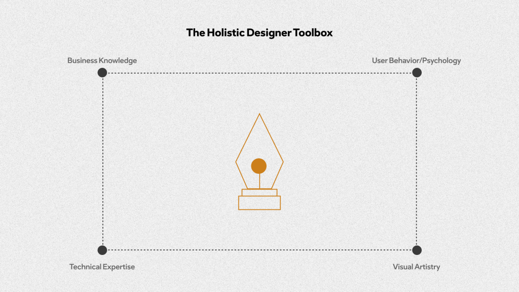
This doesn't mean that all designers should break their heads pursuing an MBA degree for two years in order to obtain these skills. Many designers are more intuitive and obtain these skills by getting their hands on actual projects, others might prefer to stay aside and focus on more specific areas of design rather than covering the whole umbrella, and so on, but in fact, getting familiar with the subjects mentioned here will definitely give you an advantage as a designer and help you feel more confident when sitting at the strategic table, and have better communication and operational processes with your teammates.

Today I have completed about 90% of my MBA degree, and I think that getting into this decision has provided me with a more unique perspective towards design and given me lots of personal fulfillment. If you're like me and you're considering following a similar path, my advice is to first of all, have a clear plan in advance (where do you want to lead your career to, where do you see yourself in 10 years, etc.), and secondly, keep your mind open to new knowledge. Don't let it overwhelm you or intimidate you; the process can be tough in the beginning, but it will pay off when you start seeing the changes in your brain and in your tangible results as a designer.

Bonus: Business readings & tools for designers

November 21, 2024

The Positive Power of Friction

What if, in a world obsessed with frictionless experiences, what users need is actually some resistance? 

In my previous article, I wrote about why designers should remain critical of trendy narratives and avoid applying one-size-fits-all solutions in whatever product we design. Now, I'd like to attack another very prevalent myth in our industry: that "seamless is always better." It's been a guiding principle that has grown so strong, we rarely take a second to question it.

But here is where it gets interesting: picture transferring your life savings with a tap of a single button, or deploying code to production without any confirmatory steps in between. Suddenly, "seamless" doesn't quite be the sexy term, does it? It is here that "friction" in UX design becomes a powerful tool-those intentional moments of pause and resistance that, when thoughtfully applied, can actually build trust, foster comprehension, and lead to superior user experiences. By understanding the psychological underpinnings driving strategic friction, we can create interfaces that not only smooth the flow but actually serve the best interests of our users. Let’s take look…

The Psychology Behind Friction

In definition, friction in user experience refers to any aspect of an interface or interaction that slows down, complicates or creates resistance in the user journey toward their intended goal, and it can manifested in at least three forms:

  • Cognitive Friction (the mental effort required to process information)
  • Emotional Friction (negative emotional responses triggered by obstacles or delays: frustration or confusion)
  • Physical Friction (tactile sensations experienced during interactions: such as resistance felt when touching touchscreens)

Friction and Cognitive Processing

To better understand how friction affects cognitive processing, we need to examine Don Norman's concepts of constraints and natural mapping, which are essential elements of psychology in user experience design.

Constraints are elements that guide user actions and limit their possibilities. They can be physical, semantic, cultural, or logical, and they help users navigate interfaces more effectively. Natural mapping, on the other hand, refers to the intuitive relationships between controls and their effects, where controls are arranged in a way that reflects their outcomes.

A classic example of a constraint is the physical design of a USB connector that prevents incorrect insertion (yes, we all struggle with this!). For natural mapping, consider the intuitive double-tap gesture on your iPhone screen to wake it up – the action naturally maps to the desired outcome.

Think about a time when you encountered an interface that required you to pause and think critically about your actions to avoid serious mistakes. If you've ever used your banking app to send money to a new contact, you've experienced this moment of necessary reflection – and that's precisely where friction plays its crucial role.

When we introduce moderate challenges and constraints for our users, we enhance cognitive processing by encouraging deeper engagement with the task at hand. These strategic friction points, implemented through constraints and natural mapping, prompt users to think critically about their actions. This leads to better information retention and understanding, helping users navigate complex systems without feeling overwhelmed while preventing potential mistakes.

When Frictions Builds Trust

Here there are a few common examples on which friction helps build user trust on the product they use:

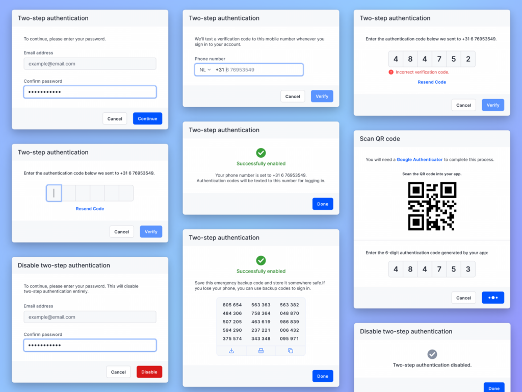
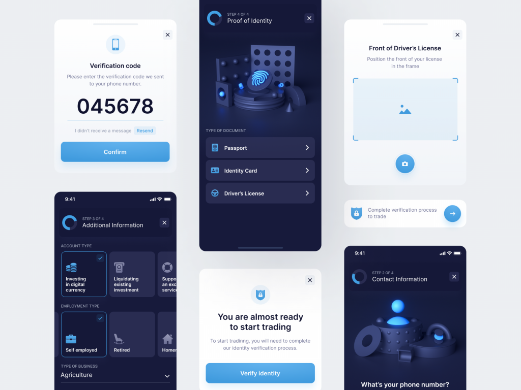
Financial Applications: In Fintech, requiring users to undergo identity verification during account signup and transactions, friction is widely used as a protective measure against fraud and users errors, which leads user to appreciate the added layer of security in those platforms that apply it.

Medical Applications: Certain critical operations (like medication administration and surgical procedures) introduce friction through additional verification steps in order to ensure that all necessary checks are performed.

Ecommerce: When applying to financing options at checkout, providing users with a quick eligibility check introduces friction in order to help them understand their chances of approval without impacting their credit score.

2FA Concepts by Alvish Baldha on Dribble

Strategic implementation of friction

Once you understand how friction works and its underlying psychological concepts, there are several ways to use friction strategically to deepen user engagement and enhance outcomes. This strategic implementation is what we call Positive Friction.

When designers strategically reveal complex information through progressive disclosure, we create deliberate pauses in the user journey that allow for better retention, information processing, and mistake prevention by reducing cognitive overload. For instance, financial applications can introduce verification steps for large transactions, while educational platforms can use gamification to gradually unlock advanced features. These aren't random obstacles in the user journey – they're intentional spaces for reflection and understanding that lead to more capable and satisfied users.

By implementing thoughtful constraints and natural mapping alongside meaningful feedback loops, we can use positive friction to enhance rather than impede the user experience. When we carefully limit options and provide clear feedback on user actions, we create a scaffolded environment that builds user confidence through guided exploration. To determine whether your product design requires friction, evaluate the type of interaction you're aiming for:

  • High-Stake Interactions: Scenarios where the user needs to interact with sensitive information-some friction is highly recommended. Example: In a banking application, this could be when multi-factor authentication is needed in order to reduce fraud.
  • Low-Stake Interactions: Those scenarios where the interaction of the user with the information is not that critical. For instance: In social media interactions, too much friction may nag users, so a more fluid and seamless experience should be in focus.
Know-Your-Customer interaction design by Mateusz Piatek on Dribbble

Here are some quick tips that can serve as small decision framework for UX designers when it comes to friction:

  • Identify user context: Understand the context in which users will interact with your product
  • Assess User Needs: As always recommended, conduct user research to gather insights on their preferences and pain points
  • Have clear goals of your design - what level of trust and security enhancement are you looking to achieve?
  • Feedback mechanisms: Providing meaningful feedback during critical processes, can help users understand the necessity of certain frictions (for instance: verifying their identity several times)

Embracing Friction

Moderate friction, when applied thoughtfully, can significantly enhance user engagement, especially in high-stakes scenarios where users need to be more attentive. Don Norman's concepts of constraints and natural mapping are vital principles for creating intuitive interfaces. By understanding these principles, we can better determine the appropriate level of friction needed in scenarios where heightened user attention is crucial.

October 22, 2024

The Paradox of Complex UIs: When More is More

It was 2012, and I had just landed my first job as a junior UI designer. Like many newcomers to the field, I was completely enchanted by the design principles that dominated the industry: "simplify, minimize, reduce cognitive load." These mantras weren't just guidelines—they were gospel. I embraced minimalism with the fervor of a convert, proudly crafting an edutech dashboard that could have been mistaken for a luxury Swiss watch website—all negative space, subtle typography, and pristine layouts.

But design has a way of humbling us. As I matured in my role as a digital product designer, real-world user interactions began to chip away at my minimalist idealism. Through countless user testing sessions and product iterations, I discovered an inconvenient truth: for some specific scenarios, complex interfaces were showing up better results than minimalist ones. This revelation challenged everything I thought I knew about good design, and opened my eyes to a fascinating paradox in user experience design.

The Complexity Paradox

While the trend in UX and UI design in the recent years has steadily moved toward minimalism with principles like progressive disclosure  (which in principle advocates for providing users with fluid and intuitive experiences that keeps them from getting overwhelmed in order to take decisions), there’s a bunch of new evidence that might suggest that some groups users actually perform better with and prefer complex and cluttered interfaces. 

The variables of these user groups can vary from level of familiarity with technology, to even demographic and cultural ones. 

Nowadays, more designers and technology experts are talking more and more about this oversimplification of the user interfaces in our everyday life, and how that’s contributing to an homogeneity of the digital products we use, removing the creativity and perplexity factor that captivated us in the early years of the Internet.

Understanding the psychology

There are several reasons why this phenomenon occurs and I would like to deep-dive in all of them but, my aim here is not to write an academic article about cognitive load and information density, but rather than that, I’m going to just focus on the three aspects than in my personal experience as a designer, have had the biggest impact on me when it comes to decision-making in regard of the simplicity vs complexity discussion:

1. The Occam’s Razor Dilemma 

Occam’s Razor is a philosophical principle that establishes that in order to face two competing explanations for the same phenomenon, we must choose the most simple one, or in other words, the one that requires less assumptions. In more technical terms: "Entia non sunt multiplicanda praeter necessitatem” (we must not multiply the entities unnecessarily).

In designer-friendly words this could be actually rephrased to something like “the most simple interfaces are the most intuitive and accessible ones”, however, this principle also recognizes that if an explanation or more complex solution offers a better performance or user satisfaction, then it can potentially be the best solution overall.

The Occam’s Razor principle works better when both complex and simple explanations have the same explanation power, if a complex interface provides the user with a superior experience in a specific context (ie: advanced users UIs), then the complexity is completely justified.

2.  The (Subjective) Perception of Value

There’s a tendency known as complexity bias by which some users (especially advanced ones) associate higher amounts of features with higher amount of value, which can lead to a wrong believe that having more features is equivalent to having a better experience. In those scenarios, users who are searching for specific solutions might feel unsatisfied with oversimplified interfaces that don’t put the tools they need right in front of their fingertips.

3. Natural mapping (and the technology paradox)

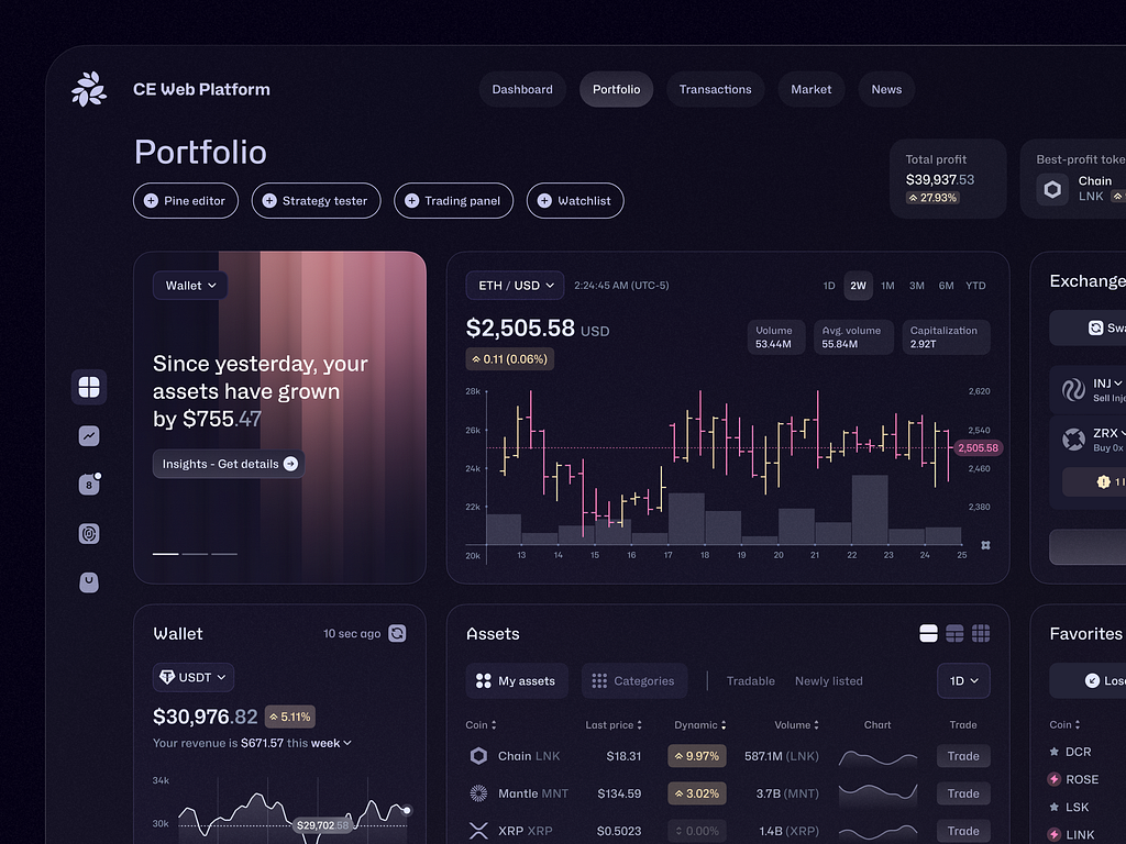
Modern technology often require to introduce features that make usability a lot more complex (for example, a trading dashboard is by necessity complex, reducing its complexity could be potentially counterproductive), and for those specific technologies, complexity can be highly attractive for achieving more advanced and specific tasks (if they are well-designed, of course).

Trading dashboard concept by Conceptzilla on Dribble

Implications for Us Designers

By understanding the principles mentioned above, there have been several methods that I have used in order to apply them whenever in specific scenarios in which maximalism seems to be the answer and I want to share them with you:

  • Use the Miller’s Law: If you have to put a lot of features in a complex UI, group them by chunks in order to facilitate the cognitive processing of those elements 
  • Offer configuration options: If feasible, allow them to hide, show, arrange certain elements (or even create a minimal mode and an advanced one)
  • Always consider context: Always ask yourself: Who are my users? How familiar they are with this technology? What’s their cultural context? What’s they average age? And so on.
  • Always question oversimplification: Minimalism should not be the only way to go for all the scenarios
  • And the most important: Test with real users, interview them and see what level of UI complexity works better for them.

Finding the sweet spot.

As designers, we have the responsibility to move beyond stablished or trendy laws and principles and put the necessities of our users and customers as first place in order to design the best experiences for them. In one hand we must be critical and in the other, we must be emphatic.

The key is not to universally simplify or complicate our interfaces, neither to find the one-fits-all solution to repeat over and over in every single project we work on (that would make our jobs too easy and too boring), the key is to know well our users and understand them, only then wee can make informed decisiones about the appropriate level of complexity in our designs.

It all depends on your users, their needs and their preferences.

logo-footer

Portfolio: View | Request Access    Blog     Info 

View