It was 2012, and I had just landed my first job as a junior UI designer. Like many newcomers to the field, I was completely enchanted by the design principles that dominated the industry: "simplify, minimize, reduce cognitive load." These mantras weren't just guidelines—they were gospel. I embraced minimalism with the fervor of a convert, proudly crafting an edutech dashboard that could have been mistaken for a luxury Swiss watch website—all negative space, subtle typography, and pristine layouts.
But design has a way of humbling us. As I matured in my role as a digital product designer, real-world user interactions began to chip away at my minimalist idealism. Through countless user testing sessions and product iterations, I discovered an inconvenient truth: for some specific scenarios, complex interfaces were showing up better results than minimalist ones. This revelation challenged everything I thought I knew about good design, and opened my eyes to a fascinating paradox in user experience design.
The Complexity Paradox
While the trend in UX and UI design in the recent years has steadily moved toward minimalism with principles like progressive disclosure (which in principle advocates for providing users with fluid and intuitive experiences that keeps them from getting overwhelmed in order to take decisions), there’s a bunch of new evidence that might suggest that some groups users actually perform better with and prefer complex and cluttered interfaces.
The variables of these user groups can vary from level of familiarity with technology, to even demographic and cultural ones.
This observation challenges our fundamental assumptions about user interface design and raises questions about our obsession to oversimplify everything for everyone.
Nowadays, more designers and technology experts are talking more and more about this oversimplification of the user interfaces in our everyday life, and how that’s contributing to an homogeneity of the digital products we use, removing the creativity and perplexity factor that captivated us in the early years of the Internet.
Understanding the psychology
There are several reasons why this phenomenon occurs and I would like to deep-dive in all of them but, my aim here is not to write an academic article about cognitive load and information density, but rather than that, I’m going to just focus on the three aspects than in my personal experience as a designer, have had the biggest impact on me when it comes to decision-making in regard of the simplicity vs complexity discussion:

1. The Occam’s Razor Dilemma
Occam’s Razor is a philosophical principle that establishes that in order to face two competing explanations for the same phenomenon, we must choose the most simple one, or in other words, the one that requires less assumptions. In more technical terms: "Entia non sunt multiplicanda praeter necessitatem” (we must not multiply the entities unnecessarily).
In designer-friendly words this could be actually rephrased to something like “the most simple interfaces are the most intuitive and accessible ones”, however, this principle also recognizes that if an explanation or more complex solution offers a better performance or user satisfaction, then it can potentially be the best solution overall.
The Occam’s Razor principle works better when both complex and simple explanations have the same explanation power, if a complex interface provides the user with a superior experience in a specific context (ie: advanced users UIs), then the complexity is completely justified.
2. The (Subjective) Perception of Value
There’s a tendency known as complexity bias by which some users (especially advanced ones) associate higher amounts of features with higher amount of value, which can lead to a wrong believe that having more features is equivalent to having a better experience. In those scenarios, users who are searching for specific solutions might feel unsatisfied with oversimplified interfaces that don’t put the tools they need right in front of their fingertips.
3. Natural mapping (and the technology paradox)
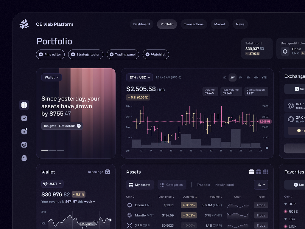
Modern technology often require to introduce features that make usability a lot more complex (for example, a trading dashboard is by necessity complex, reducing its complexity could be potentially counterproductive), and for those specific technologies, complexity can be highly attractive for achieving more advanced and specific tasks (if they are well-designed, of course).

Implications for Us Designers
By understanding the principles mentioned above, there have been several methods that I have used in order to apply them whenever in specific scenarios in which maximalism seems to be the answer and I want to share them with you:
- Use the Miller’s Law: If you have to put a lot of features in a complex UI, group them by chunks in order to facilitate the cognitive processing of those elements
- Offer configuration options: If feasible, allow them to hide, show, arrange certain elements (or even create a minimal mode and an advanced one)
- Always consider context: Always ask yourself: Who are my users? How familiar they are with this technology? What’s their cultural context? What’s they average age? And so on.
- Always question oversimplification: Minimalism should not be the only way to go for all the scenarios
- And the most important: Test with real users, interview them and see what level of UI complexity works better for them.

Finding the sweet spot.
As designers, we have the responsibility to move beyond stablished or trendy laws and principles and put the necessities of our users and customers as first place in order to design the best experiences for them. In one hand we must be critical and in the other, we must be emphatic.
The key is not to universally simplify or complicate our interfaces, neither to find the one-fits-all solution to repeat over and over in every single project we work on (that would make our jobs too easy and too boring), the key is to know well our users and understand them, only then wee can make informed decisiones about the appropriate level of complexity in our designs.
Sometimes, less is less, other times, more is actually more.
It all depends on your users, their needs and their preferences.


No Comments.